The responsibilities of a CTO are multifold – Monitoring technological trends, designing a strategy that aligns with those trends in the most profitable way, and identifying new areas to invest in the R&D effort are some of them.
Even more so, for a CTO assessing growth and returns on R&D is of primary importance when it comes to governing and creating an integrated strategy. A successful quarter would have sustained growth and in parallel, maximize return on R&D investments.
Budding and established businesses need competitive analysis for knowing the latest trends, figuring out what would suit them best, and then further get the budget sanctioned. Resultantly, CTOs have to monitor competitors’ R&D in a highly dynamic technological market. Not only can competitors’ strategies be leveraged but defensive measures can also be taken.
Take, for instance, a new technology domain your company is venturing into –
- How can a CTO assess which aspect of research needs how much funding?
- What strategy has established players followed?
- What direction are competitors heading in?
All this in light of business goals needs to be answered.
Now there are a certain set of challenges that makes it difficult for CTOs to make actionable decisions based on the data they usually deal with. It’s cluttered and usually, a systematic analysis is unavailable from an IP (research) perspective.
Why making decisions based on raw data is a key challenge faced by CTOs?
Most of the IP data is logged in excel files and although some graphs and charts could be plotted based on it, to get actionable insights, CTO at times has to deal with raw data in an excel sheet.
Now mere raw data is not presentable to the management or C-Suite and making it presentable may take a huge toll on time and resources. While there’s nothing wrong with that approach, actionable insights cannot be driven from this in a suffocating time frame.
Of the many requirements an executive position can have, analysis and representation of this data in a consumable format remain unresolved. This is primarily because of the nature of their work as at times even they don’t know what they require from the data they are dealing with.
They need the flexibility to play with the data to generate something that could guide the R&D direction of their company.
Problem? There’s a solution.
How Competitive Intelligence Dashboards can help solve CTO’s problems?
Dashboards are dynamic tools that can solve the key challenge faced by CTOs. They provide a 30K view to the entire domain and can be further drilled down. They’re like digital maps, once you have figured out where you want to go (the problem area), you can go deeper to find the way.
Similarly, dashboards with various charts and graphs generate insights on the fly for consumption. They answer any and all questions in the relevant domain of the study. They have ‘filters’ for you to shortlist relevant data. These filters correspond to dates, competitors, technology domain, etc. These filters add to the dynamicity of the charts which helps draw attention to relevant areas and answer other questions that you might have.
Want to know more? Let’s walk you through one of these interactive dashboards, and in the process, have a look at some of these above-mentioned filters.
To better illustrate the features of these dashboards, we constructed an interactive dashboard portraying the competitive intelligence of three top companies working in the Artificial Intelligence domain viz Apple, Alphabet, and Facebook.
Can’t wait? For a quick preview, view the entire interactive dashboard here but I’d recommend you wait till the end to better understand the filters and features of this dashboard.
How to find crisp answers on the R&D activities of competitors?
Competitive intelligence in R&D for a CTO needs to be precise and aligned with relevant parameters. These parameters should be such that they help in evaluating competitors and tell about their strategy.
Insights are derived by an in-depth analysis of the R&D activities of the chosen competitors and can be further drilled down to the required level and more questions can be answered about R&D.
But strategy derivation is not a cakewalk.
Strategy is the outcome of answering other important questions like —
- Are current parameters enough for a proper assessment?
- Who is leading R&D in various technology sub-nodes?
- Which competitor’s tech is most followed over the decade?
- What is the ratio of their most valuable assets to average ones?
These questions can be answered and moreover represented visually, for they need to be further presented to the CEO and other stakeholders for figuring out the next steps. You can assess a competitor’s strategy and predict the next steps. This cannot simply be predicted by the number of patents filed.
The next section talks about parameters that can give proper insights.
Are current parameters enough for a proper assessment?
There are so many insights that can be derived from patents. Especially when you take into account the AI-based assessment of portfolios. The problem with these assessments is that they tend to be very broad. So, here we used a coalition of accurate manual analysis and our in-house AI tools to draw attention to more subtle aspects of a patent portfolio, which happen to be true indicators of a competitor’s strategy.
Take, Google (Alphabet) for instance –
This dashboard shows scores (normalized on a scale of 0 to 1) which can help with the assessment.
Technological coverage shows how many subnodes of a given domain are covered by the selected player. The score here indicates Alphabet has patents in almost all areas of AI.
Radicalness is an indicator of how innovative a player is, generally.
Continuity in research indicates whether the player is inclined towards innovating further on their research.
Generality shows in how many areas is the research applicable.
Geographic coverage shows how many jurisdictions they have secured patents in.
The advantage of this dashboard is that it provides an eagle-eye view and you can dive a level deeper with the help of indicators highlighting the objective of a different competitor. Now the dynamic element here is you can compare competitors head-on and you won’t have to skim through different pages of the presentation to identify patterns.
It takes a closer look instead of simply crunching numbers. This was the overall assessment of AI portfolios. The rest of the questions are directed toward answering questions a CTO would be interested in figuring out.
Who is leading R&D in various technology sub-nodes?
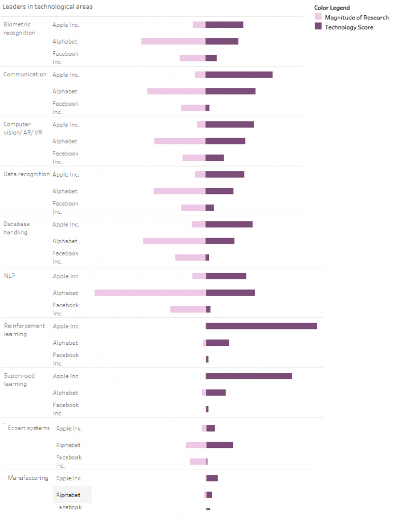
Segmenting the technology into major sub-nodes and analyzing research in those nodes can tell a lot about the competitor’s strategy.
The chart above shows the magnitude in filing with respect to the technology score. An interesting observation is how in some cases, the technology score is higher even though the exhaustiveness of research is relatively lower.
Take for instance ‘Communication’ subnode. Here although Alphabet (Google) has more filings, Apple has a comparable score with much lesser filings, implying that their portfolio may entail some key patents in the domain. ‘Technology Score’ is a parameter that leads to correct insights about the competitor’s strategy. That is, whether they are simply protecting/ fencing a product or actually innovating in a sub-domain.
Which competitor’s tech is most followed over the decade?
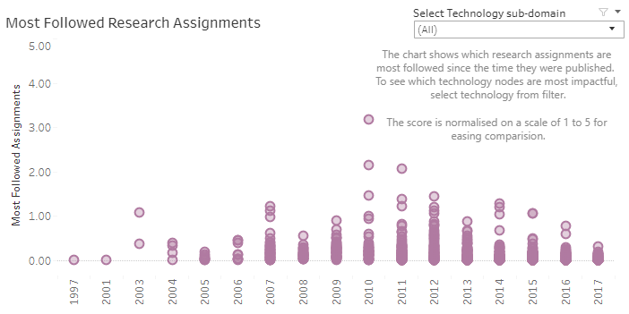
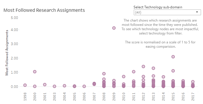
Knowing which competitors have technology that has been followed most over the years is an indicator of how usable their research is.
Alphabet –
Apple –
The chart above shows a breakdown of how the research is perceived by other players. A greater score would indicate more followed research. Comparing this with other players could also reveal a lot about their research. For instance, Alphabet has greater research assignments being followed from 2003. Although Apple doesn’t have voluminous research assignments, it does have some core patents in AI from 2008.
But does this hold for all technology subnodes?
We can view this score for all and in fact any technology subnode by selecting it from the drop-down filter on the dashboard. Using this selection helps us filter out relevant sections of data and draw insights that are focused on each aspect of the subnode.
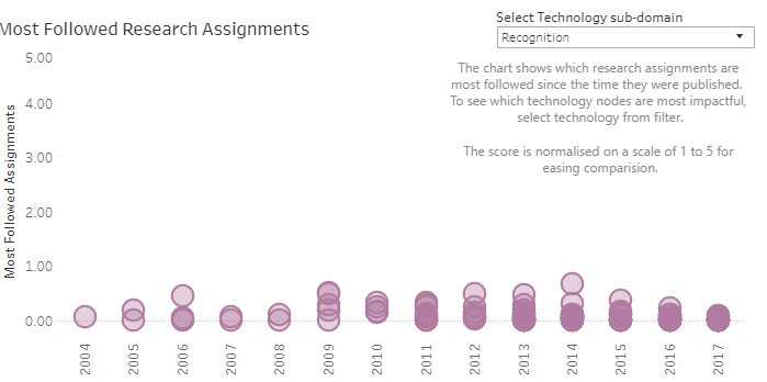
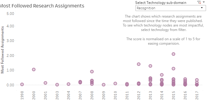
Let’s take the ‘recognition’ subnode for instance. From the above charts, it is established that overall Google has more followed research, but in this subnode, we find Apple’s research is more followed by other competitors-
Alphabet’s portfolio in ‘recognition’-
Apple’s portfolio in ‘recognition’–
Thus, filtering adds the dynamic aspects of slicing and dicing data to a granular level such that it helps in distinguishing insights from regular trends.
What is the ratio of their most valuable assets to average ones?
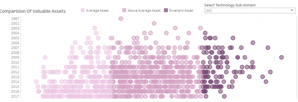
The above chart depicts Alphabet’s research over the years, in all technology sub-nodes. This chart clearly depicts the focus of the patent holder. As the color legend depicts, the darker shades show more valuable assets.
Selecting a technology area and knowing which competitor has a stronger hold on which domain could be insightful to a CTO. This should answer all questions on the exhaustiveness of search, quality of search and when did significant research take place in a technology subnode.
For instance, Alphabet (Google) has an increase in high-value assets by 2017 in NLP. This indicates a strong business objective and expected filings and acquisitions in the coming years in the niche.
As a CTO, do I really need a Dashboard?
For executives and CTOs whose job responsibilities entail digesting numbers and taking decisions based on a quick analysis, dashboards could prove to be a boon.
These dashboards provide analysis that is easy to read and derive insights from. The visuals clearly indicate what data has to say about a particular player.
The IP analysis presented in these dashboards provides more than just a research focus. Carefully studying and analyzing IP data can help in unraveling long-term business goals for competitors, and derive actionable pointers aligning with your business objective.
These were just a few exemplary insights, and there’s certainly more. Want to know which other trends and business objectives can be answered by these dashboards? Click here to view the sample interactive dashboard (for free).
This is just one example and while it pertains to big players, similar insights can be drawn for smaller players in any technology domain of your choice. Want to book a demo for this dashboard? Fill out the form below and our team will get in touch.
Authored by: Krati Pandya, Solutions.

